
A fresh take on pest management branding
Logo Design
Brand Refresh
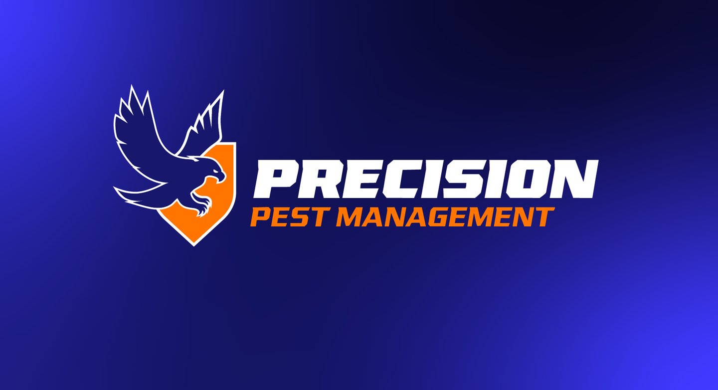
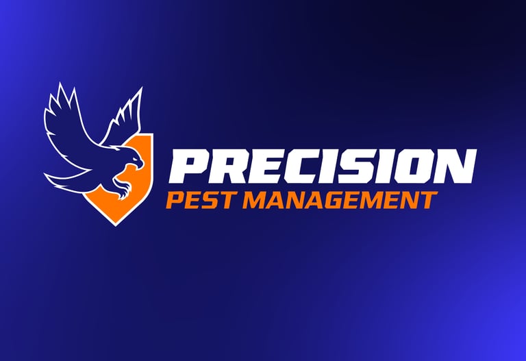
Precision Pest Management had reached out wanting an updated brand and logo. When looking online, there were many brands with red and green colors — each logo featuring some variant of an insect.
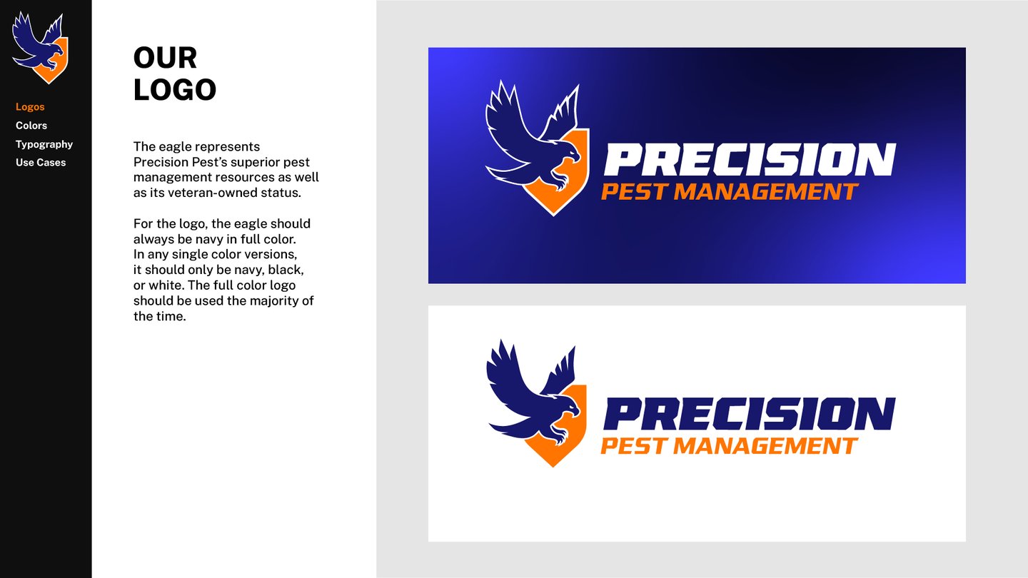
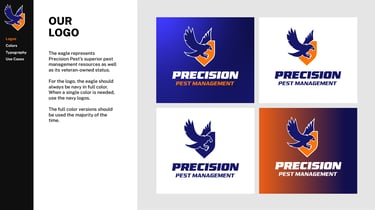
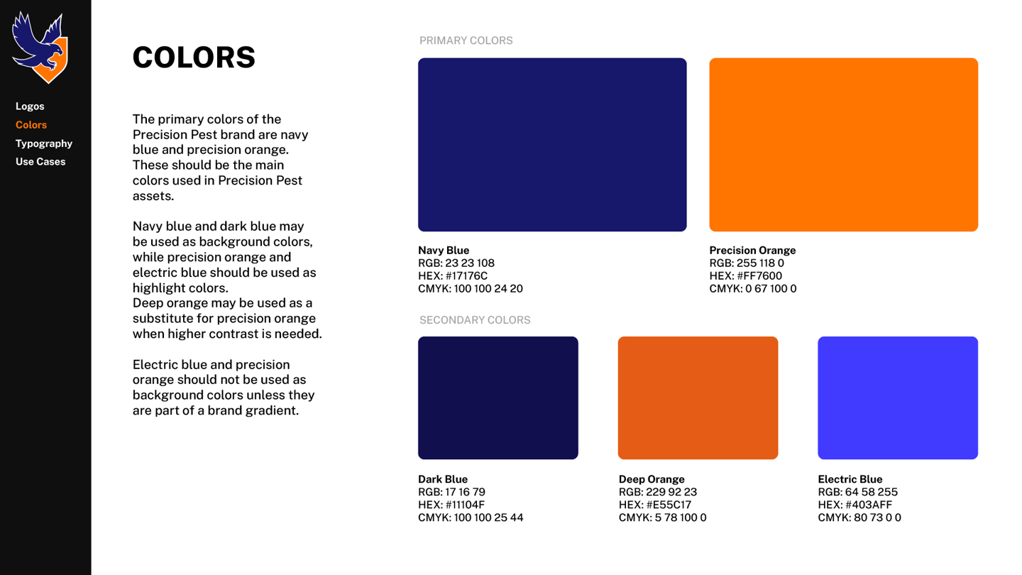
To help distinguish their brand, we used a blue and orange color palette. We also came at the "pest management" side from a different angle — birds are insects most dangerous predator. As such, we centered our logo designs around incorporating a predator bird in each design. The client also wanted to incorporate a shield in the design to emphasize the superior protection they provide.
PRECISON PEST